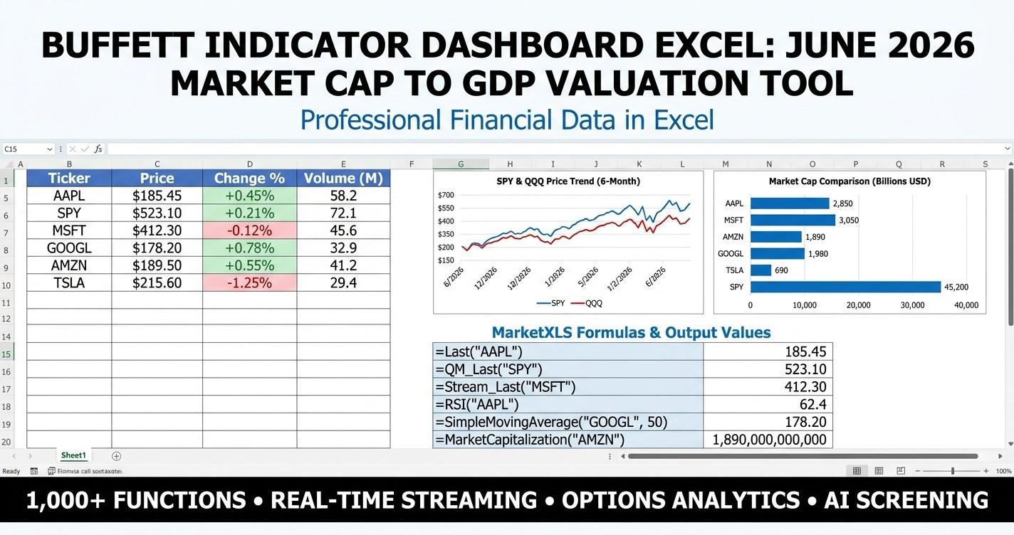
Buffett Indicator dashboard Excel searches usually land on a tired old chart and a static number with no context. This guide ships a different answer: a premium June 2026 template that turns the classic Wilshire-5000-to-GDP ratio into a working dashboard with KPI tiles, a 30-year history line, sector contribution heatmap, 16-country comparison, mean-reversion scenarios, and a mega-cap concentration screener. Every cell is a live MarketXLS formula in the template version. Both the sample and the live-formula version are linked below.
The Buffett Indicator currently sits near 200%. That is roughly 135% above the long-run average of 85%, and 45% above the post-globalization modern average of 138%. Whether that reads as "stretched but justified" or "history's biggest valuation bubble" depends on your assumptions, and this template was built to expose every one of those assumptions so you can pressure-test them yourself.
Quick Look: Buffett Indicator By the Numbers (June 2026)
| Metric | Value | Context |
|---|---|---|
| Total US market cap (Wilshire 5000) | $61.7T | Up from $58.4T at year-end 2025 |
| Nominal US GDP (Q1 2026 SAAR) | $30.86T | BEA quarterly estimate |
| Buffett Indicator | 199.9% | +6.6 points vs 2025 close |
| Long-run average (1971-2000) | 85% | Buffett's original anchor |
| Modern average (2010-2025) | 138% | Post-globalization anchor |
| Premium vs long-run | +135% | Z-score around +2.6 |
| 10-year reversion to 138% target | -22% | Total return, ex-dividends |
| 10-year reversion to 85% target | -52% | Total return, ex-dividends |
| Mag-7 share of US market cap | ~32% | NVDA, MSFT, AAPL, AMZN, GOOGL, META, TSLA |
The headline number is doing a lot of work. The next sections unpack what it actually measures, why it has drifted higher, and how to think about position sizing when one metric flashes deep red while bond yields, credit spreads, and earnings revisions look fine.
What the Buffett Indicator Actually Measures
Warren Buffett described the ratio in a December 2001 Fortune essay as "probably the best single measure of where valuations stand at any given moment." The math is simple: total market value of publicly traded US companies divided by nominal Gross Domestic Product, expressed as a percentage.
Numerator proxy: the Wilshire 5000 Total Market Index captures roughly 99% of US-listed equity market cap.
Denominator: nominal GDP, taken from the Bureau of Economic Analysis quarterly seasonally-adjusted annual rate.
The intuition is that corporate value cannot grow indefinitely faster than the economy in which corporations operate. When the ratio stretches above its long-run mean, future returns tend to disappoint. When it sinks well below, future returns tend to surprise to the upside. Buffett's own zones from the 2001 essay:
- Under 50%: Significantly undervalued
- 50-75%: Modestly undervalued
- 75-90%: Fair value
- 90-115%: Modestly overvalued
- Over 115%: Significantly overvalued
Those thresholds were written when the long-run average sat near 85%. Today's reading of 200% is more than four standard deviations above that 85% anchor, which is one reason critics argue the static thresholds need updating. The template handles this by letting you override both the long-run anchor and the modern anchor inputs so you can run the math under whichever framework you prefer.
Why the Indicator Has Drifted Higher
Four structural forces have pushed the ratio steadily upward since the early 2000s:
-
Globalization of revenue. S&P 500 companies now derive roughly 40% of revenue outside the US. The numerator captures all that overseas value while the denominator stays domestic. That mechanical mismatch alone explains 20-30 points of the modern premium.
-
Lower interest rates. From the 2007 highs near 5% to multi-decade lows of 0.5% in 2020, the 10-year Treasury yield discounted equity cash flows at progressively lower rates. Even with rates back near 4% in 2026, the cumulative re-rating from the previous era has not fully unwound.
-
Rising tech and asset-light weight. Software, payments, and platform businesses earn fatter margins on fewer assets than the industrial economy that dominated indices in the 1970s. Higher steady-state returns on capital deserve higher multiples, mechanically.
-
Buybacks shrinking float. Aggressive net buyback activity over the last 15 years has reduced share count without reducing market cap. That pushes per-share earnings higher and supports the numerator.
None of these forces invalidate the Buffett Indicator. They do mean the long-run average is the wrong anchor for short-horizon planning. The template gives you both anchors and lets you slide the modern average input around to find the level that best fits your worldview.
The Premium Template - What's Inside
The download bundles two workbooks: a static sample version (every number pre-filled with a 2026-06-04 snapshot plus formula comments) and a template version (every cell is a live MarketXLS formula). Both ship with the same 11-sheet structure.
-
Cover. Branded title page, edition, version, last-updated date, and a clickable-style table of contents. Hidden gridlines, navy + gold palette, table of contents.
-
How To Use. Eight-step setup walkthrough plus a 22-function MarketXLS reference table. Every function name appears with its exact syntax and a one-line description so you can copy any cell formula into your own spreadsheets.
-
Dashboard. The headline view. Six KPI tiles across the top show current ratio, US market cap, US nominal GDP, long-run average, premium vs long-run, and z-score. A 30-year line chart plots the Buffett Indicator against both the long-run and modern averages. Below sits a sector contribution heatmap with conditional formatting on weight (data bars) and year-over-year growth (red to green color scale), plus a horizontal bar chart of sector weights. Frozen panes, hidden gridlines, print area set for landscape.
-
Inputs & Controls. Yellow input cells with thick navy borders. Dropdown validation on Selected Scenario, Risk Tolerance, and Reference Index. Editable anchors for both the long-run average and the modern average so you can rerun the math under your own assumptions. Custom ticker slots feed the screener sheet.
-
Scenario Analysis. Seven mean-reversion paths over 10 years, from "Bull (No Reversion)" through "Long-Run Mean" to "Crisis Trough." Each row shows the terminal ratio, GDP growth assumption, implied future GDP, implied future market cap, total return, annualized return, and real return (assuming 3% inflation). Conditional formatting: color scales on return columns, data bars on terminal ratio, three-arrow icon set on annualized return. Below the table sits a sensitivity matrix crossing terminal ratio (60 to 200) against GDP growth (2.5% to 5.5%), color-coded red where annualized returns turn negative.
-
Strategy & Allocation. Sixteen-row table mapping four Buffett-ratio regimes to suggested sleeve allocations: equity core weight, defensive tilt, real assets, international value, cash, and a hedge sleeve. Historical 10-year CAGR and volatility shown for each sleeve, with data bars on weight and a red-to-green color scale on historical CAGR.
-
Portfolio Sizing. Converts your portfolio size input into dollar allocations across the six sleeves. Pie chart of the recommended allocation. In the template version, the dollar column uses live formula references back to the Inputs sheet so updating one cell flows through.
-
Global Comparison. Buffett Indicator for 16 major markets (US, Switzerland, Netherlands, Taiwan, Japan, Canada, France, Australia, UK, South Korea, Germany, India, China, Brazil, Mexico, Spain). Current ratio, country's own historical average, premium percentage, z-score estimate, and a regime label. Conditional formatting: color scale on premium, three-symbol icon set on z-score, data bars on current ratio. Use this sheet to identify which geographies offer cheaper valuations relative to their own history.
-
Mega-Cap Concentration. 25 largest US-listed companies with live formulas for price, market cap, percentage of total US market cap, TTM PE, P/S, dividend yield, YTD return, and beta. Conditional formatting on all of them. Sort by Mkt Cap or % of US Mkt to see exactly how concentrated the headline ratio is in a handful of names.
-
Methodology. Long-form explainer of the Buffett Indicator definition, data sources, the long-run vs modern average debate, scenario mechanics, sensitivity matrix construction, mean reversion caveats, and a candid limitations section.
-
Glossary & Disclaimer. 17 term definitions plus the educational-only disclaimer.
Every sheet has its tab color set (navy for Cover, blue for Dashboard, yellow for Inputs, amber for Scenarios, green for Strategy and Portfolio, red for Global, gray for How To Use and Methodology). Cover and Dashboard hide gridlines for a presentation-grade look. Every analytical sheet has frozen panes and a footer crediting MarketXLS and the specific functions used.
How to Read the Dashboard
When you open the template, look at the KPI tiles first. The current ratio of 199.9% is the headline. The premium tile of +135% tells you how stretched the ratio is versus the long-run anchor. The z-score of roughly +2.6 puts that premium in standard deviation terms - a once-in-a-generation kind of reading by classical statistics, although the modern-average framework softens it considerably.
The historical chart tells the longer story. The Buffett Indicator broke above 100% in 1998, peaked at 151% in 2000 before the dot-com unwind, sank to 78% in 2009, then climbed in a series of higher highs and higher lows through the QE era. The 2021 peak of 211% remains the all-time high. The 2022 reset took it back to 156%, well above anything seen pre-pandemic. From there it has marched higher, now sitting just shy of the 2021 peak.
The sector contribution heatmap shows where the market cap is concentrated. Technology alone accounts for 31% of total US market cap. Communication Services adds another 9%. Consumer Discretionary (largely Amazon and Tesla) contributes 11%. Those three buckets together hold roughly half of US market value, which is a meaningful change from the late 2010s and a much larger change from the pre-2000 era when those weights were closer to a quarter combined.
Using the Scenario Analysis Sheet
This is where the template earns its keep. The scenario table maps seven forward paths over 10 years:
- Bull (No Reversion): terminal ratio stays at 200%, GDP grows at 4.5% nominal. Annualized return roughly 4.5% (purely from GDP growth flowing through).
- Soft Landing: terminal ratio drifts to 170%, GDP grows 4.2%. Annualized return roughly 2.4%.
- Modern Mean: terminal ratio settles at 138% (the post-2010 average), GDP grows 4.0%. Annualized return roughly 0.5%.
- Base (Half Reversion): terminal ratio splits the difference at 142%, GDP grows 3.8%. Annualized return roughly 0.4%.
- Long-Run Mean: terminal ratio reverts to the 85% pre-2000 anchor, GDP grows 3.5%. Annualized return roughly -5.0%.
- Bear (Deep Reversion): terminal ratio undershoots to 70%, GDP grows 3.0%. Annualized return roughly -7.3%.
- Crisis Trough: terminal ratio hits 55%, GDP grows 2.5%. Annualized return roughly -10.8%.
Notice that even the Modern Mean scenario, which simply has the ratio drift back to its own post-globalization average, produces a near-zero annualized return over 10 years. That is the math the dashboard puts in front of you, before you add or subtract anything for dividends, buybacks, or international diversification.
The sensitivity matrix below the scenarios lets you test how those answers change as you flex the two inputs. A terminal ratio of 100% with 4.5% nominal GDP growth produces an annualized loss of roughly 2.5% over 10 years. The same 4.5% growth with a terminal ratio of 170% produces a positive 2.4% annualized return. Read across rows and down columns to find the combinations that turn the math green or red.
Building the Buffett Indicator in MarketXLS
The template uses live MarketXLS formulas for everything that can be live. The macro layer relies on these:
=WilshireIndex("US")         Wilshire 5000 total market index level
=RealGDP("US")               Real US Gross Domestic Product
=GDPPriceDeflator("US")      GDP price deflator (real to nominal conversion)
=TreasuryRate10Y("US")       10-year US Treasury yield (for ERP context)
=UnemploymentRate("US")      Headline unemployment rate
=MoneySupplyM2("US")         M2 money supply
=VIX("US")                   CBOE Volatility Index
For the ticker-level mega-cap screener:
=QM_Last("NVDA")             Live last price
=MarketCapitalization("NVDA") Live market cap in USD
=PERatio("NVDA")             Trailing 12-month P/E
=PriceToSales("NVDA")        P/S ratio
=DividendYield("NVDA")       Trailing dividend yield
=ChangePercentYTD("NVDA")    Year-to-date price change
=Beta("NVDA")                Beta vs S&P 500
=Sector("NVDA")              GICS sector classification
=Name("NVDA")                Company name
The percentage-of-total-market-cap column on the Mega-Cap sheet divides each ticker's market cap by the Wilshire 5000 level, so you can see exactly how much of the headline number comes from each name. That is how you discover that NVIDIA alone now accounts for over 6% of US listed equity market cap, more than the entire Energy sector.
What's Inside the Template (10-Sheet Walkthrough)
For the searcher who skimmed straight to here, the bulleted product description:
- Cover sheet with branded title, edition, last-updated date, table of contents, navy + gold color treatment, hidden gridlines.
- How To Use sheet with 8 numbered setup steps and a 22-function MarketXLS reference table.
- Dashboard sheet with 6 KPI tiles, 30-year Buffett Indicator history chart, sector contribution heatmap, and a horizontal bar chart of sector weights. Two embedded charts. Conditional formatting on weight (data bars) and YoY growth (color scale).
- Inputs & Controls sheet with yellow input cells, thick navy borders, dropdown validation on three fields, editable historical anchors.
- Scenario Analysis sheet with 7 forward paths, total return, annualized return, real return, color scales, data bars, icon sets, plus a 7x7 sensitivity matrix.
- Strategy & Allocation sheet with 16 rows mapping ratio regimes to sleeve weights with historical CAGR and volatility.
- Portfolio Sizing sheet with 6 sleeves, live dollar allocations linked to the Inputs sheet, and a pie chart of the recommended split.
- Global Comparison sheet with 16 country rows showing current ratio, country's own historical average, premium, z-score, and regime, with conditional formatting on every column.
- Mega-Cap Concentration sheet with 25 largest US-listed companies, 11 columns of live MarketXLS data including a percentage-of-total-market-cap column, frozen panes, and four layers of conditional formatting.
- Methodology sheet with 9 long-form explainers covering definition, data sources, both averages, threshold zones, scenario math, sensitivity construction, reversion caveats, limitations, and a not-investment-advice section.
- Glossary & Disclaimer sheet with 17 term definitions and the educational-only disclaimer.
Every sheet has a tab color set, frozen panes, a MarketXLS footer with the specific functions used, and consistent typography across all 11 sheets.
Download the Template
Download the templates:
- - Pre-filled with 2026-06-04 snapshot data. Every data cell has a comment showing the underlying MarketXLS formula.
- - Live MarketXLS formulas in every cell. Open with the MarketXLS add-in active and hit Data > Refresh All to pull the latest market caps, prices, ratios, and macro indicators.
Both files are free. The premium design quality is the upgrade over the base daily template pipeline.
Choosing the Right Approach
The Buffett Indicator is one tool in a long shelf of macro valuation gauges. Used alone it is a blunt instrument. Used alongside the equity risk premium, the CAPE ratio, the earnings yield gap, and bottom-up free-cash-flow yield work, it provides a useful sanity check on aggregate valuation.
A few honest observations from running the template:
- Timing is not the use case. The ratio first crossed 100% in 1998, stayed elevated through 2000, then sank for nearly a decade. Anyone who sold equities in 1998 on the strength of this indicator missed the final 70% of the dot-com bubble and then had to time the bottom.
- The modern average matters more than the long-run average for most planning horizons. Reversion to 85% has not been seen for 20 years and is hard to argue for without also assuming a structural unwind of globalization, lower rates, and tech dominance.
- Sector composition changes everything. A US market that is 31% tech naturally clears at a higher Buffett Indicator than a US market that is 20% tech. The template's sector contribution heatmap helps you see this clearly.
- International diversification looks cheap by this metric. Brazil at 51%, Spain at 58%, Germany at 65%, China at 71%. Whether those discounts are warranted (rule of law, growth prospects, currency risk) is a separate question, but the relative valuation gap is real.
The template puts the math in front of you. What you do with it is between you and your written investment policy.
Frequently Asked Questions
What is the Buffett Indicator showing right now?
The Buffett Indicator (total US listed market cap divided by nominal GDP) sits at 199.9% as of June 4, 2026. That is approximately 135% above the long-run average of 85% and 45% above the post-2010 modern average of 138%. By the threshold zones Warren Buffett laid out in his 2001 Fortune essay, the reading is "significantly overvalued."
How do I calculate the Buffett Indicator in Excel?
In MarketXLS the cleanest expression is =WilshireIndex("US") * 1000 / (RealGDP("US") * GDPPriceDeflator("US") / 100). The Wilshire 5000 level is denominated in millions, so the multiplier converts to total dollars. The real GDP times the price deflator gives nominal GDP. The template ships this construction prewired across the Dashboard sheet.
Is the Buffett Indicator a market timing signal?
No. The ratio has historically been a useful indicator of long-horizon expected returns (10-year forward) but a poor short-term timing tool. The indicator crossed 100% in 1998 and stayed elevated through the entire 2000 peak. It has now stayed above 100% nearly continuously since 2013. Use it for return expectation setting and position sizing, not for entry and exit timing.
What is the long-run average for the Buffett Indicator?
The long-run average from 1971 to 2000 is approximately 85%. Some sources cite 70-90% depending on the exact period sampled. The template defaults to 85% as the long-run anchor and 138% as the post-2010 modern anchor. Both are editable in the Inputs & Controls sheet.
Why has the Buffett Indicator drifted higher?
Four structural forces: globalization of US-listed company revenue (the numerator grows with foreign sales while the denominator stays domestic), structurally lower interest rates (especially post-2008), rising tech and asset-light business weight (higher steady-state returns deserve higher multiples), and aggressive net buyback activity reducing share float. Together these explain roughly 50-60 points of the modern premium versus the long-run average.
How does the US Buffett Indicator compare to other countries?
The Global Comparison sheet in the template ranks 16 major markets. As of June 2026: Switzerland at 256%, Taiwan at 245%, US at 200%, Netherlands at 167%, Japan at 159%, India at 143%, Canada at 138%, France at 120%, Australia at 114%, UK at 108%, South Korea at 103%, China at 71%, Germany at 65%, Spain at 58%, Brazil at 51%, Mexico at 37%. Switzerland and Taiwan run structurally higher than the rest due to listed mega-cap concentration relative to domestic GDP.
The Bottom Line
Buffett Indicator dashboard analysis works best when it is honest about its own limits. The current 200% reading is the highest non-bubble reading in history, and the highest reading ever excluding the brief 211% peak of late 2021. That fact is real. So is the structural drift in the long-run average that explains a meaningful chunk of the modern premium. A premium template should give you both readings and let you decide which framework guides your allocation.
This template ships the headline number, the full 30-year history, the sector contribution behind the headline, the country comparison context, the 10-year forward scenarios, and the mega-cap concentration drill-down. Open it, refresh, change the assumptions in the Inputs sheet, and watch the entire workbook update. That is the difference between a static chart and a working dashboard.
To explore more about how MarketXLS turns macro and ticker-level data into Excel workflows, visit marketxls.com or book a demo to see the platform in action.