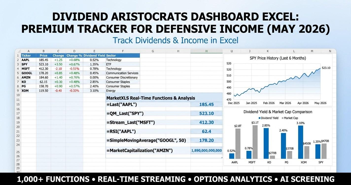
Dividend aristocrats dashboard excel - if that is what you are searching for in May 2026, you are likely trying to answer two questions at once: which long-streak dividend names are still paying you a defensible yield, and which ones are starting to stretch their payout ratio in a slower-growth environment. This guide walks through the framework, shows the exact MarketXLS formulas, and gives you a professional-grade Excel template that puts the answer on a single dashboard.
Why a Dividend Aristocrats Dashboard Matters in May 2026
The S&P 500 Dividend Aristocrats are companies that have raised their dividend for at least 25 consecutive years. That is a high bar. It filters out the cyclicality of energy super-majors, the boom-bust of REITs, and most of the highest-yielding traps that show up in raw screeners. What remains is a watchlist of mostly defensive consumer staples, healthcare, industrials, utilities, and a handful of financials and materials names with multi-decade capital discipline.
Going into the May 2026 print of that watchlist, three things are different from a year ago:
- The 10-year Treasury yield has settled in the 4.20% to 4.40% range, which means a 2.5% dividend yield no longer looks generous on its own. The spread to a risk-free coupon matters more than the headline yield.
- Earnings growth has slowed across staples and consumer discretionary as elasticity returns to pricing. That pushes payout ratios higher even when dividends are only growing 5% to 7%.
- Sector dispersion inside the Aristocrats list is wider than usual. Some industrial Aristocrats are trading at 16x with 1.7% yields. Some consumer staples Aristocrats are trading at 19x with 3.0% yields. The screener needs to surface that dispersion.
A dividend aristocrats dashboard answers four practical questions on a single sheet:
- What is the median yield, payout ratio, and consecutive-increase streak across my watchlist right now?
- Which names are still hitting the safe payout ratio band (under 60% for staples, under 70% for utilities)?
- Which sectors offer the best yield-per-unit-of-payout-stretch?
- What does my income look like in 5, 10, and 20 years at three different dividend growth rates, with and without reinvestment?
The premium template at the end of this post answers all four. Let's start with the data table.
Dividend Aristocrats: May 2026 Snapshot Across 28 Names
The watchlist below covers consumer staples, healthcare, industrials, energy, materials, utilities, and consumer discretionary - the seven sectors where most of the Aristocrats live. All numbers are educational illustrations as of 2026-05-02. In the live template they pull from MarketXLS in real time.
| Ticker | Sector | Yield | Forward Yield | Payout Ratio | Streak (yrs) |
|---|---|---|---|---|---|
| KO | Consumer Staples | 3.08% | 3.18% | 73% | 62 |
| PG | Consumer Staples | 2.42% | 2.50% | 60% | 68 |
| PEP | Consumer Staples | 3.45% | 3.55% | 72% | 52 |
| WMT | Consumer Staples | 1.18% | 1.22% | 35% | 51 |
| CL | Consumer Staples | 2.32% | 2.40% | 60% | 60 |
| KMB | Consumer Staples | 3.55% | 3.65% | 71% | 54 |
| HRL | Consumer Staples | 3.62% | 3.72% | 76% | 58 |
| SYY | Consumer Staples | 2.78% | 2.86% | 60% | 54 |
| JNJ | Healthcare | 3.18% | 3.28% | 60% | 62 |
| ABT | Healthcare | 1.92% | 1.98% | 50% | 52 |
| BDX | Healthcare | 1.62% | 1.68% | 35% | 53 |
| MDT | Healthcare | 3.28% | 3.38% | 56% | 47 |
| XOM | Energy | 3.55% | 3.65% | 42% | 41 |
| CVX | Energy | 4.18% | 4.30% | 60% | 38 |
| MMM | Industrials | 5.85% | 6.00% | 92% | 65 |
| CAT | Industrials | 1.75% | 1.82% | 28% | 30 |
| EMR | Industrials | 1.95% | 2.02% | 45% | 67 |
| ITW | Industrials | 2.25% | 2.32% | 50% | 60 |
| GD | Industrials | 2.10% | 2.18% | 40% | 33 |
| MCD | Consumer Disc. | 2.45% | 2.55% | 56% | 48 |
| LOW | Consumer Disc. | 1.95% | 2.02% | 32% | 61 |
| TGT | Consumer Disc. | 3.32% | 3.42% | 53% | 54 |
| AFL | Financials | 2.05% | 2.12% | 28% | 41 |
| CINF | Financials | 2.50% | 2.58% | 38% | 64 |
| APD | Materials | 2.85% | 2.92% | 65% | 42 |
| LIN | Materials | 1.30% | 1.35% | 38% | 32 |
| NEE | Utilities | 3.42% | 3.55% | 65% | 30 |
| ED | Utilities | 3.65% | 3.75% | 68% | 50 |
That table sits inside the screener tab of the dashboard, with conditional formatting on yield (greener as yield rises), payout ratio (greener as payout falls), and one-year return (icon set so you can spot drawdowns at a glance).
A few things stand out from this snapshot:
- The median yield across the 28 names is 2.6%. That means roughly half of the watchlist sits at or below the dividend yield of a 10-year Treasury after tax. Yield alone is not the case for owning these names. Dividend growth and durability are.
- The median payout ratio is 56%. That is healthy - it leaves room for buybacks, capex, and dividend hikes. But the watchlist contains real outliers. MMM is at 92%. KMB is at 71%. HRL is at 76%. Those are the names where the dividend safety conversation actually matters.
- The median streak is 52 years. Half of these companies have raised the dividend through stagflation, the dot-com crash, the financial crisis, and the COVID shock. That track record is the entire point of the Aristocrats screen.
What Goes On the Dashboard Tab
The Dashboard tab opens with six KPI tiles in a single row across the top of the sheet. Each tile is a merged cell block with a thick navy border, a label in white on navy, and a large number in 28-point gold or red depending on the metric. The six tiles are:
- Median Yield - the median dividend yield across the watchlist, formatted as a percent.
- Median Payout - the median payout ratio. A green fill triggers if the median is under 60%, amber from 60% to 75%, red above 75%.
- Median Streak - the median number of consecutive years of dividend increases.
- Yield Hits - the count of tickers with yield above 3%.
- Safe Payouts - the count of tickers with payout ratio under 60%.
- Defensive Score - a 0 to 100 composite that rewards low beta and concentration in defensive sectors. Anything above 70 is shaded gold.
Below the KPI row, two embedded charts sit side by side. The left chart is a horizontal bar chart of dividend yield by ticker, sorted descending. The right chart is a horizontal bar chart of consecutive-increase streak by ticker, again sorted descending. Both charts use the navy and gold palette so they read like a single product, not two screenshots glued together.
Underneath the charts, the conditional-formatted screener block runs the full 28-name table with sector, yield, forward yield, five-year average yield, dividend per share, payout ratio, streak, PE, beta, market cap, and one-year return. The user can filter and sort that block in place.
The Exact MarketXLS Formulas Used
Every cell in the live template version pulls from MarketXLS. There are no hand-typed numbers. These are the verified formulas the screener block uses:
=DividendYield("KO")
=ForwardAnnualDividendYield("KO")
=FiveYearAverageDividendYield("KO")
=DividendPerShare("KO")
=DividendPayoutRatio("KO")
=ConsecutivePeriodOfIncreasingDividendPayout("KO", "Annual")
=ConsecutivePeriodOfUninterruptedDividendPayout("KO", "Annual")
=PERatio("KO")
=Beta("KO")
=MarketCapitalization("KO")
=Sector("KO")
=ProfitMargin("KO")
=StockReturnOneYear("KO")
=qm_last("KO")
A few practical notes on the formulas:
DividendYieldreturns the trailing twelve-month yield. If you want the forward-looking number based on the most recently announced dividend, useForwardAnnualDividendYieldinstead. The dashboard puts both side by side so the spread between them is visible. A wide gap usually means the company just raised the dividend or the price has moved sharply.ConsecutivePeriodOfIncreasingDividendPayout(symbol, periods)returns the streak of consecutive raises. Use"Annual"to match the Aristocrats definition.Quarterlyis also valid but the streak count is then four times higher and harder to compare against the 25-year threshold.DividendPayoutRatioreturns the trailing payout ratio computed against earnings. For REITs and MLPs this metric is less meaningful than the FFO or distributable cash flow payout, but the Aristocrats list has neither, so the standard ratio works.Betais the trailing beta against the S&P 500. The Defensive Score on the dashboard rewards lower betas because the entire premise of an Aristocrats screen is risk-adjusted income.
Income Projection: How the Reinvestment Sheet Works
The Income Projection sheet runs six scenarios in a single block. Three dividend growth rates - conservative 4%, base 6%, optimistic 8% - are crossed with two reinvestment options - reinvest dividends, do not reinvest. For each scenario, the sheet projects the income stream out 5, 10, 15, and 20 years from a starting position the user defines on the Inputs tab.
The math is straightforward. With reinvestment, the projection compounds both the share count and the dividend per share. Without reinvestment, only the dividend per share grows. The formula uses POWER on a per-year basis:
Income (no reinvest) = StartingShares * StartingDPS * POWER(1 + DGR, Year)
Income (reinvest)    = StartingShares * StartingDPS * POWER(1 + DGR, Year) * (PriceGrowthFactor)
In the template, the price growth factor for the reinvest case is approximated by the dividend growth rate plus the starting yield, which is a reasonable proxy for the total return that drives the share-count compounding. You can override that with your own assumption on the Inputs sheet.
The point of the sheet is not to forecast a single number. It is to make the spread between scenarios visible. A 6% dividend growth rate compounded over 20 years roughly triples the income stream. An 8% rate roughly quintuples it. A 4% rate roughly doubles it. The width of that fan tells you how sensitive your retirement income plan is to dividend growth, which is the variable most investors underweight.
Sector Comparison: Which Sectors Pay the Best Per Unit of Payout Stretch
The Sector Comparison sheet groups the watchlist by sector and computes the median yield, median payout ratio, median streak, and an efficiency score for each sector. The efficiency score divides median yield by the gap between median payout ratio and 50%, so sectors that pay higher yields without stretching the payout ratio score better.
In the May 2026 snapshot, the rough ranking comes out:
- Energy - high yield (3.85% median), low payout (51%), but only two names so dispersion is wide. Best yield-per-payout stretch in the watchlist.
- Utilities - solid yield (3.55%), moderate payout (66%), and very low beta. The classic defensive income sector.
- Consumer Staples - the deepest sector on the list. Median yield 2.95%, median payout 65%. The payout stretch has been climbing every year for the last decade.
- Healthcare - 2.50% median yield, 50% median payout. Cleaner balance sheets than staples, lower yields.
- Industrials - widest dispersion. MMM at 92% payout drags the sector. Strip out the outlier and the median payout falls to 47%.
- Consumer Discretionary - 2.55% median yield, 47% median payout. Decent quality but more cyclicality than staples.
- Financials - low yields (2.30% median) but the lowest payout ratios on the list (33% median). Lots of room to grow the dividend.
- Materials - 2.10% median yield, 51% median payout. A small slice of the Aristocrats list.
The Sector Comparison sheet displays these numbers with conditional formatting on each column so the leader and laggard pop visually.
Strategy Playbook: Three Use Cases for the Dashboard
The Strategy Playbook sheet is the part of the template that turns the data into a workflow. There are three documented use cases.
Use Case 1: Build a Defensive Income Sleeve
The classic use case for the Aristocrats list is a defensive income sleeve inside a broader portfolio. The dashboard supports this by surfacing the names that combine yield above 3%, payout ratio under 60%, and streak above 30 years. In the May 2026 snapshot, that intersection contains a small handful of names, mostly in energy, healthcare, and utilities. The Allocation Sizer sheet takes that filtered list and lets the user enter target weights, then computes the portfolio yield, weighted payout ratio, and weighted streak.
Use Case 2: Replace a Bond Position
The second use case is replacing or reducing a bond position. With the 10-year Treasury at 4.30%, the case for replacing bonds with high-quality dividend growers is weaker than it was at 1.50%. But the dashboard makes the comparison explicit. The Methodology sheet writes out the equity-vs-bond yield gap, computes a coverage ratio (dividend yield divided by Treasury yield), and flags any name where forward yield exceeds the Treasury rate. In the current snapshot, only a few Aristocrats clear that bar (mostly energy and a few staples). That is information.
Use Case 3: Avoid the Payout Stretch Trap
The third use case is the hardest one - avoiding the names where the dividend looks safe today but is one bad year of earnings away from a freeze or a cut. The screener block on the Dashboard sheet flags any payout ratio above 75% in red. The Methodology sheet documents the historical rule of thumb that payout ratios above 80% inside the Aristocrats list are a leading indicator of either a freeze (stay flat for a year, lose Aristocrats status) or an outright cut. MMM at 92% payout is the obvious one in the May 2026 snapshot. KMB at 71% and HRL at 76% are the ones to keep watching.
Allocation Sizer: Turning the Screen Into a Portfolio
The Allocation Sizer sheet takes the filtered watchlist and sizes a portfolio. The user enters either equal weights or custom weights in a yellow input column. The sheet then computes:
- Portfolio dividend yield (weighted average of individual yields)
- Portfolio forward yield (weighted average of forward yields)
- Portfolio payout ratio (weighted average)
- Portfolio streak (weighted average, useful for seeing whether your sleeve is biased toward newer Aristocrats)
- Portfolio beta (weighted average)
- Annual income on a starting position size the user defines on the Inputs sheet
The sheet also draws a pie chart of sector weights so the user can see at a glance whether the portfolio is too concentrated in staples or too thin in financials. In the default equal-weighted configuration, the pie comes out roughly 30% staples, 14% healthcare, 18% industrials, 11% consumer discretionary, 7% financials, 7% energy, 7% materials, and 7% utilities. That is a reasonable defensive mix but not necessarily the one a given investor wants.
Methodology Sheet: How the Numbers Are Built
The Methodology sheet documents every assumption baked into the dashboard. Specifically:
- The Aristocrats definition - 25+ consecutive years of dividend increases, S&P 500 membership, minimum market cap and float requirements. The template enforces the streak requirement using
ConsecutivePeriodOfIncreasingDividendPayout("ticker", "Annual")and lets the user override the threshold on the Inputs sheet. - The payout ratio bands - safe under 60% for staples and discretionary, safe under 70% for utilities, safe under 50% for industrials and materials, safe under 80% for energy. These bands are heuristic, not regulatory.
- The Defensive Score formula - a weighted blend of low-beta share (40% weight), defensive-sector share (40% weight), and median streak above 40 years (20% weight). The score is normalized to 0-100.
- The income projection assumptions - the reinvest case assumes total return equals starting yield plus dividend growth rate, which is the long-run identity for a stable-yield equity. The no-reinvest case assumes the share count stays constant.
- The sector comparison weighting - all sector medians are computed across the names in the watchlist, not the full universe. So the sector ranking is specific to this 28-name list, not the full Aristocrats index.
Pre-Built Inputs You Can Override
The Inputs tab contains every number the rest of the workbook reads. The yellow cells are the override slots. They are:
- Treasury 10Y rate - default 4.30%, used for the equity risk premium and yield-spread calculations.
- AAA corporate yield - default 5.05%, used as a second benchmark on the Methodology sheet.
- S&P 500 yield - default 1.35%, used as the broad-market reference.
- Starting position size - default $100,000, used by the income projection and allocation sizer.
- Dividend growth rate (low/base/high) - defaults 4% / 6% / 8%, used by the income projection.
- Reinvestment toggle - default ON.
- Payout ratio bands by sector - defaults are the heuristic bands above. Can be tightened or relaxed.
- Defensive Score weights - defaults are 40/40/20. Can be rebalanced.
- Yield filter threshold - default 3%. Used by the Yield Hits KPI tile.
Every other cell in the workbook reads from this sheet. That is the template philosophy - one place to change assumptions, the entire model recalculates.
Download Links
Two versions of the template are available below.
- - opens in any Excel installation, contains illustrative numbers as of 2026-05-02, with formula references shown as comments on the data cells. Use this to inspect the structure before installing MarketXLS.
- - the live template. Every cell pulls from MarketXLS in real time. Requires the MarketXLS add-in. Refreshes the entire dashboard with one click.
Both files include all 10 sheets: Cover, How To Use, Inputs, Dashboard, Income Projection, Strategy Playbook, Allocation Sizer, Sector Comparison, Methodology, and Glossary & Disclaimer.
FAQ
What is a dividend aristocrats dashboard excel?
A dividend aristocrats dashboard excel is a single-workbook tracker that pulls live yield, payout ratio, dividend growth, consecutive-increase streak, and sector data for the S&P Dividend Aristocrats and surfaces it on a dashboard with KPI tiles, conditional formatting, and embedded charts. It replaces the need to copy and paste numbers from multiple data providers into a static spreadsheet.
Do I need MarketXLS to use the template?
The sample version opens in any Excel installation and shows the structure with illustrative numbers and formula comments. The premium version uses live MarketXLS formulas like DividendYield, DividendPayoutRatio, and ConsecutivePeriodOfIncreasingDividendPayout and requires the MarketXLS add-in. You can compare both side by side before deciding.
How often does the dashboard refresh?
When you open the premium version with MarketXLS installed, every cell recalculates on demand. You can also trigger a manual refresh from the MarketXLS ribbon. There is no static cache - the numbers are as fresh as your last refresh.
Why does the screener flag some Aristocrats as risky?
The screener uses payout ratio bands by sector. If a staples or healthcare name posts a payout ratio above 75%, the cell turns red. That is not a sell signal. It is a flag that the dividend growth rate is likely to slow, and that the stock is one bad earnings year away from a freeze (which would knock it out of the Aristocrats list). The Methodology sheet documents the bands.
Can I add my own tickers?
Yes. The watchlist sits in a single block on the Dashboard sheet. Insert a row, add the ticker, and the formulas auto-fill from the Inputs tab. The KPI tiles, charts, and Sector Comparison sheet recalculate automatically. The only thing to watch is sector tagging - the Sector Comparison sheet uses the Sector formula to assign each ticker, so make sure your additions return one of the eight sectors already on the list, or extend the sector table on the Methodology sheet.
Does the template support quarterly versus annual streaks?
Yes. The streak formula takes a periods argument: ConsecutivePeriodOfIncreasingDividendPayout("ticker", "Annual") for annual and ConsecutivePeriodOfIncreasingDividendPayout("ticker", "Quarterly") for quarterly. The dashboard defaults to annual because that is the Aristocrats definition. You can switch to quarterly on the Inputs sheet, but the streak counts will be roughly four times higher and harder to compare against the 25-year threshold.
Bottom Line
A dividend aristocrats dashboard is not a buy list. It is a workflow. The May 2026 version of the template surfaces three things at once: which long-streak names are still paying enough yield to be interesting, which ones are stretching their payout ratios in a slower-growth tape, and what your reinvested income stream looks like across three growth scenarios. The premium MarketXLS version refreshes every metric in one click, so the dashboard never goes stale.
If you build a defensive income sleeve, replace bonds with quality dividend growers, or just want a single workbook that tracks the entire Aristocrats universe, this template is built for that workflow.
and the .
For the full library of MarketXLS dashboards, screeners, and trackers, see marketxls.com. To see the platform in action with your own watchlist, book a demo.