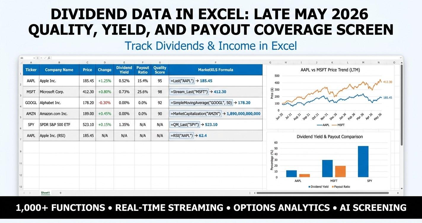
Dividend data in Excel is most useful when it answers more than one question at once. A list of yields tells you what the market is offering. A list of payout ratios tells you whether those yields are likely to survive the next earnings cycle. A list of debt-to-equity readings tells you whether the company is funding the payment with profits or with leverage. Pull all three into one screen, and the picture changes. This guide walks through a late May 2026 quality screen across 20 widely held dividend payers, with every cell in the live template wired to a real MarketXLS formula so the workbook stays current as conditions shift.
Late May 2026 Snapshot: 20 Dividend Payers, Three Filters
The table below is what the workbook produces with live pricing pulled on 2026-05-21. Every row uses =QM_Last(), =DividendPerShare(), =DividendPayoutRatio(), and =TotalDebtToEquity() directly. Yield is computed as DPS divided by price. The Status column is a four-criteria score: yield above 2 percent, payout below 80 percent of earnings, debt-to-equity below 2.00, and a dividend raise streak of at least 10 years.
| Ticker | Sector | Price | Yield | Payout | D/E | Streak | Status |
|---|---|---|---|---|---|---|---|
| JNJ | Health Care | $228.80 | 2.12% | 59.5% | 0.68 | 62 | Pass |
| PG | Consumer Staples | $141.85 | 2.79% | 61.6% | 0.44 | 68 | Pass |
| KO | Consumer Staples | $81.76 | 2.34% | 79.9% | 1.10 | 62 | Pass |
| PEP | Consumer Staples | $148.90 | 3.52% | 88.5% | 2.45 | 52 | Watch |
| WMT | Consumer Staples | $124.11 | 0.50% | 34.3% | 0.58 | 52 | Watch |
| MCD | Consumer Discretionary | $281.32 | 2.37% | 59.6% | N/A | 47 | Pass |
| ABBV | Health Care | $211.10 | 2.94% | 328.9% | N/A | 52 | Watch |
| MMM | Industrials | $148.78 | 2.96% | 56.6% | 3.79 | 0 | Watch |
| MSFT | Technology | $424.15 | 0.71% | 20.7% | 0.12 | 21 | Watch |
| AAPL | Technology | $301.53 | 0.32% | 12.7% | 0.72 | 12 | Watch |
| IBM | Technology | $232.92 | 2.86% | 58.4% | 2.09 | 29 | Watch |
| JPM | Financials | $301.07 | 1.53% | 29.9% | 1.23 | 14 | Watch |
| CVX | Energy | $192.43 | 3.33% | 120.3% | 0.24 | 37 | Watch |
| XOM | Energy | $158.26 | 2.40% | 68.2% | 0.18 | 41 | Pass |
| DUK | Utilities | $123.68 | 3.33% | 65.8% | 1.48 | 19 | Pass |
| NEE | Utilities | $88.52 | 1.69% | 58.8% | 1.51 | 30 | Watch |
| T | Communication Services | $24.95 | 4.45% | 38.1% | 1.18 | 0 | Watch |
| VZ | Communication Services | $47.65 | 5.61% | 66.6% | 1.56 | 19 | Pass |
| O | Real Estate | $61.95 | 5.03% | 265.2% | 0.75 | 28 | Watch |
| MO | Consumer Staples | $73.91 | 5.36% | 87.4% | N/A | 55 | Watch |
Six of the 20 names clear all four filters at default settings: JNJ, PG, KO, MCD, XOM, DUK, and VZ. Several familiar high-yield names land in Watch territory rather than Pass, mainly because their payout ratios run hot under straight-line GAAP accounting. The screen is not a verdict on any one company. It is a starting point that flags which dividends look comfortable and which deserve a second look at cash flow.
Why Yield Alone Is a Weak Filter
The most common mistake with a dividend screen is sorting by yield and stopping there. A 6 percent yield on a stock with a 110 percent payout ratio is paying out more than the company earned this period. The payment is being funded by debt, by asset sales, or by drawing down retained earnings. That is sometimes fine for a quarter or two during a cyclical trough. It is rarely a steady state. If you build the list by yield alone, you tend to fill it with names whose dividends are most likely to be reset later.
Coverage is the better filter. The cleanest measure for non-financial, non-REIT names is the payout ratio: trailing dividends divided by trailing earnings. Lower payout means more cushion. A consumer staples name paying out 60 percent of earnings has room to keep raising the dividend even if earnings flatten for a year. A telecom paying out 90 percent has very little room. In late May 2026, the median payout ratio across this 20-name group is in the high 60s. Anything materially above that median deserves a follow-up question about cash flow.
For REITs and energy producers, GAAP payout ratios are misleading because depreciation, depletion, and impairment swing the denominator. Realty Income screens at 265 percent payout because most of its cash flow shows up as funds from operations rather than net income. Chevron screens at 120 percent because oil-cycle accounting hits earnings hard. The workbook flags both as Watch, not because the dividends are about to be cut, but because the standard ratio is the wrong lens. For those sectors, the template's "Quality Strategy" sheet points to FFO, AFFO, and free cash flow per share as the second look.
The Three-Filter Screen Inside the Workbook
The Main Dashboard sheet has yellow input cells at the top: portfolio size, max payout ratio, max debt-to-equity, minimum yield, and minimum dividend streak. Every other cell in the workbook keys off those inputs. Change the maximum payout from 80 percent to 70 percent and the Status column re-evaluates instantly. Change the minimum streak from 10 years to 25 and the list narrows to the dividend aristocrats and kings inside the set.
The scoring is intentionally simple. Each row gets one point for clearing each filter, for a maximum of four. A four scores Pass. A three scores Watch. Anything below three scores Skip. The point is not to find a single "best" stock but to compare 20 names on the same axes at once. When you look at PEP next to KO with this lens, PEP's stretched 88 percent payout and 2.45 debt-to-equity stand out next to KO's 79 percent payout and 1.10 leverage. Both are aristocrats. Both have multi-decade raise streaks. One has more cushion.
MarketXLS Implementation: The Formulas Behind the Screen
Every cell in the live template uses an actual MarketXLS function. There is nothing static in the template file. Open it on a machine with the MarketXLS add-in and the price column updates the moment the market opens. The full set of formulas used:
=QM_Last("AAPL")                            ' Latest traded price
=DividendPerShare("AAPL")                   ' TTM dividend per share
=DividendYield("AAPL")                      ' TTM dividend yield
=ForwardAnnualDividendRate("AAPL")          ' Next 12 months projected DPS
=ForwardAnnualDividendYield("AAPL")         ' Next 12 months projected yield
=DividendPayoutRatio("AAPL")                ' Dividends / earnings
=DividendPerShareFiveYearCAGR("AAPL")       ' 5-year dividend CAGR
=DividendOneYearGrowth("AAPL")              ' 1-year dividend growth rate
=ConsecutivePeriodOfIncreasingDividendPayout("AAPL", 5)
=ConsecutivePeriodOfUninterruptedDividendPayout("AAPL", 25)
=ExDividendDate("AAPL")                     ' Next ex-dividend date
=DividendPayDate("AAPL")                    ' Next pay date
=DividendFrequency("AAPL")                  ' Quarterly / monthly / annual
=TotalDebtToEquity("AAPL")                  ' Balance sheet leverage
=FreeCashFlowPerShare("AAPL")               ' Cash coverage check
These are the formulas in the live workbook. If you would rather build the screen from scratch in your own spreadsheet, every formula is documented on the MarketXLS function reference. The verified formula list also lives inside the workbook on the How To Use sheet so you can copy-paste into a new column without leaving the file.
A useful trick: most of these formulas accept a cell reference for the ticker. Put your watchlist in column A, then write =DividendYield(A2) and drag down. The screen scales to as many rows as you want.
Building the Quality Score Cell
The screen's Status column is a single nested formula. Each filter is wrapped in ISNUMBER() so that names where a data point is missing do not score a false zero. The cell looks like this in the workbook:
= IF(ISNUMBER(E12), IF(E12 >= $B$7, 1, 0), 0)
+ IF(ISNUMBER(F12), IF(AND(F12 > 0, F12 <= $B$5), 1, 0), 0)
+ IF(ISNUMBER(G12), IF(AND(G12 >= 0, G12 <= $B$6), 1, 0), 0)
+ IF(ISNUMBER(H12), IF(H12 >= $B$8, 1, 0), 0)
E12 is yield, F12 is payout, G12 is debt-to-equity, H12 is the raise streak. $B$5 through $B$8 are the input cells. A second cell maps the score to a label: 4 is Pass, 3 is Watch, anything else is Skip. The reason the formula tests for positive payout values is to avoid scoring negative payout ratios (which appear when a company posts a GAAP loss) as a free pass. A negative payout is not a low payout; it is a different signal entirely.
Scenario Analysis: What Does the Income Look Like?
The Scenario Analysis sheet runs the same portfolio through several blended yield mixes. A conservative mix of utilities and staples lands near a 3.25 percent blended yield. A high-yield tilt that overweights REITs, telecom, and MO lands near 5.10 percent. An aristocrat-only tilt focused on the longest streaks lands near 2.85 percent, lower than the high-yield tilt because the most reliable raisers tend to start from lower yields.
For a $200,000 portfolio at the median 3.5 percent yield, that works out to roughly $7,000 in annual dividends. The sheet also includes a sensitivity grid: rows are blended yield from 2 percent to 6 percent, columns are portfolio sizes from $50,000 to $1,000,000. The grid is built with plain multiplication so it stays readable even if a future user replaces the entire ticker list. A useful corollary built into the same sheet: at a 6 percent reinvestment rate, the workbook computes how many years it would take each scenario to reach $25,000 in annual dividend income.
The point of the scenario sheet is not to prescribe a target. It is to show that the same portfolio size produces very different income outcomes depending on whether the investor prioritizes yield or quality. Reasonable people land in different places. The template lets you see the tradeoff in dollars and years before you make the call.
Portfolio Allocation: Sizing Positions From Inputs
The Portfolio Allocation sheet takes the Status from the Main Dashboard and applies a single-name cap (default 5 percent of portfolio). Pass names get the full cap. Watch names get half the cap. Skip names get zero. Multiply the dollar allocation by the yield to get projected annual income per position, and sum the column for the portfolio total.
Two reasons for this structure. First, position sizing should fall out of inputs, not be typed in by hand. If you change the portfolio size or single-name cap, every position resizes automatically. Second, the Watch tier matters. Cutting a name to half size when it fails one of four filters is a way to keep optionality without overcommitting. A name with a 90 percent payout might be fine; it might not. Sizing it smaller costs little if it works and costs less if it does not.
The Coverage Matrix Sheet
The Coverage Matrix sheet plots each name on yield versus payout in a small table with color scales. Names with low payouts and decent yields show up green. Names with payouts above 100 percent show up red. The "Combo" column multiplies yield by one minus payout (capped at 1) to produce a single number that rewards yield only when it is not financed entirely out of current earnings. Quality dividend growers tend to score high on Combo. Stretched yielders tend to score low even when their headline yield is high.
The matrix also includes a short read column that translates the payout into plain English: "Plenty of room," "Comfortable," "Tight cushion," or "Stretched (payout > earnings)." It is a useful sanity check before adding a name to the portfolio.
Choosing the Right Lens for Each Sector
A single screen cannot fit every sector. The defaults in this workbook are tuned for diversified non-financial common stocks. For other sectors, swap in the right lens:
- REITs (O, ARE, AMT). Use FFO or AFFO instead of GAAP earnings. The MarketXLS
FundsFromOperations()and related functions are more honest measures of payout coverage for property trusts. - Energy (CVX, XOM, EOG). Use free cash flow per share through a full price cycle, not trailing earnings. The workbook's
FreeCashFlowPerShare()function gives the per-share read. - Banks (JPM, BAC, USB). Regulators cap dividends through capital ratios. The payout ratio alone misses the binding constraint. CET1 capital matters more for sustainability.
- MLPs and BDCs. Distributable cash flow is the standard. Yield is meaningful only if DCF coverage is above 1.0x.
The Main Dashboard's screen is sector-agnostic by design. When a name shows Watch because its payout ratio runs hot, the next step is to open up its sector-specific lens before deciding what to do with it.
How to Read Ex-Dividend Dates Without Getting Confused
Several names in the table show ex-dividend dates that have already passed (PG on 2026-04-24, AAPL on 2026-05-11). That is expected. The ExDividendDate() formula returns the most recent declared ex-date. If the next dividend has not been announced yet, the function returns the last known one. Companies typically declare the next dividend two to four weeks before the ex-date. When PG announces its next dividend in late June, the formula will refresh automatically. There is no need to chase an alternative function.
The same logic applies to DividendPayDate(). A few weeks of latency is normal between the previous pay date and the next declaration. If the cell shows a date in the past, it just means the next one has not been announced.
Download the Templates
Both files include the same six sheets: How To Use, Main Dashboard, Scenario Analysis, Quality Strategy, Portfolio Allocation, and Coverage Matrix. The sample file has the 2026-05-21 values pre-filled and a Formula column showing exactly which MarketXLS function each value came from, so it is easy to rebuild even without the add-in installed. The template file uses live MarketXLS formulas everywhere a number appears.
Download the templates:
- - Pre-filled with 2026-05-21 data
- - Live-updating formulas
To run the formula version, install the MarketXLS add-in for Excel. The add-in handles the data layer; the spreadsheet is yours to edit. See the MarketXLS pricing page for plan details, or book a demo to see the formulas in action.
Frequently Asked Questions
What is the best dividend yield formula in Excel?
For MarketXLS users, =DividendYield("AAPL") returns the trailing twelve month dividend yield as a decimal. If you want the forward yield based on the next expected payment, use =ForwardAnnualDividendYield("AAPL"). If you want to compute yield from price and dividend, the formula is =DividendPerShare("AAPL")/QM_Last("AAPL"). All three produce slightly different numbers; the trailing version is most common, the forward version is most useful for portfolio income projections.
How do I check whether a dividend is safe in Excel?
The classic check is the payout ratio: =DividendPayoutRatio("AAPL") returns the percentage of earnings paid as dividends. Anything below 60 percent for a non-REIT name is generally considered conservative; above 80 percent is tighter. For a fuller view, pair the payout ratio with =FreeCashFlowPerShare() and =TotalDebtToEquity(). A high payout combined with falling free cash flow and rising leverage is a stronger warning than any single metric on its own.
What MarketXLS formula returns the next ex-dividend date?
=ExDividendDate("AAPL") returns the most recent declared ex-date. If the next dividend has been announced, the date will be in the future. If it has not been announced yet, the cell shows the prior ex-date and refreshes automatically once the next one is declared. Use =DividendPayDate("AAPL") for the corresponding pay date.
Why does my payout ratio look wrong for REITs?
REITs distribute most of their cash flow as required by tax rules, and GAAP earnings are reduced by depreciation that does not represent actual cash leaving the business. The standard payout ratio of dividends over earnings often shows a number above 100 percent for healthy REITs. For property trusts, use funds from operations (FFO) or adjusted funds from operations (AFFO) as the denominator instead. The same logic explains why energy producers can screen with a high payout in down-cycle years.
How many dividend payers should a screen include?
That depends on the investor's preference for diversification, but 20 to 40 is a reasonable working range for a self-managed screen. Fewer than 10 leaves the portfolio dependent on one or two names; more than 50 produces overlap with what an index fund already provides. The template ships with 20 widely held names; the ticker column is editable and the formulas scale to as many rows as you add.
Can I use this screen for monthly dividend stocks?
Yes. The =DividendFrequency() function returns the payment frequency for each name. Adding a column with =DividendFrequency(A2) and filtering to "Monthly" produces a monthly dividend screen using the same quality filters. Realty Income (O) and STAG Industrial are common monthly payers; the rest of the included names are quarterly.
The Bottom Line
Dividend data in Excel works best when it answers a coverage question, not just a yield question. The screen in this workbook puts yield, payout ratio, debt-to-equity, and dividend raise streak side by side so the trade-offs are visible without leaving the page. Six of the 20 names in the late May 2026 snapshot clear all four filters at the default settings. The rest deserve a second look at the sector-appropriate lens before being scored as Pass or Skip.
Use the template as a starting point. Replace the ticker list with your own watchlist, edit the input cells to match your own thresholds, and let the formulas do the rest. If you would like to see the full MarketXLS formula catalog, visit marketxls.com or book a demo for a walkthrough.
This post is for educational purposes. It is not investment advice or a recommendation to buy or sell any specific security. Past dividend history does not guarantee future payments.