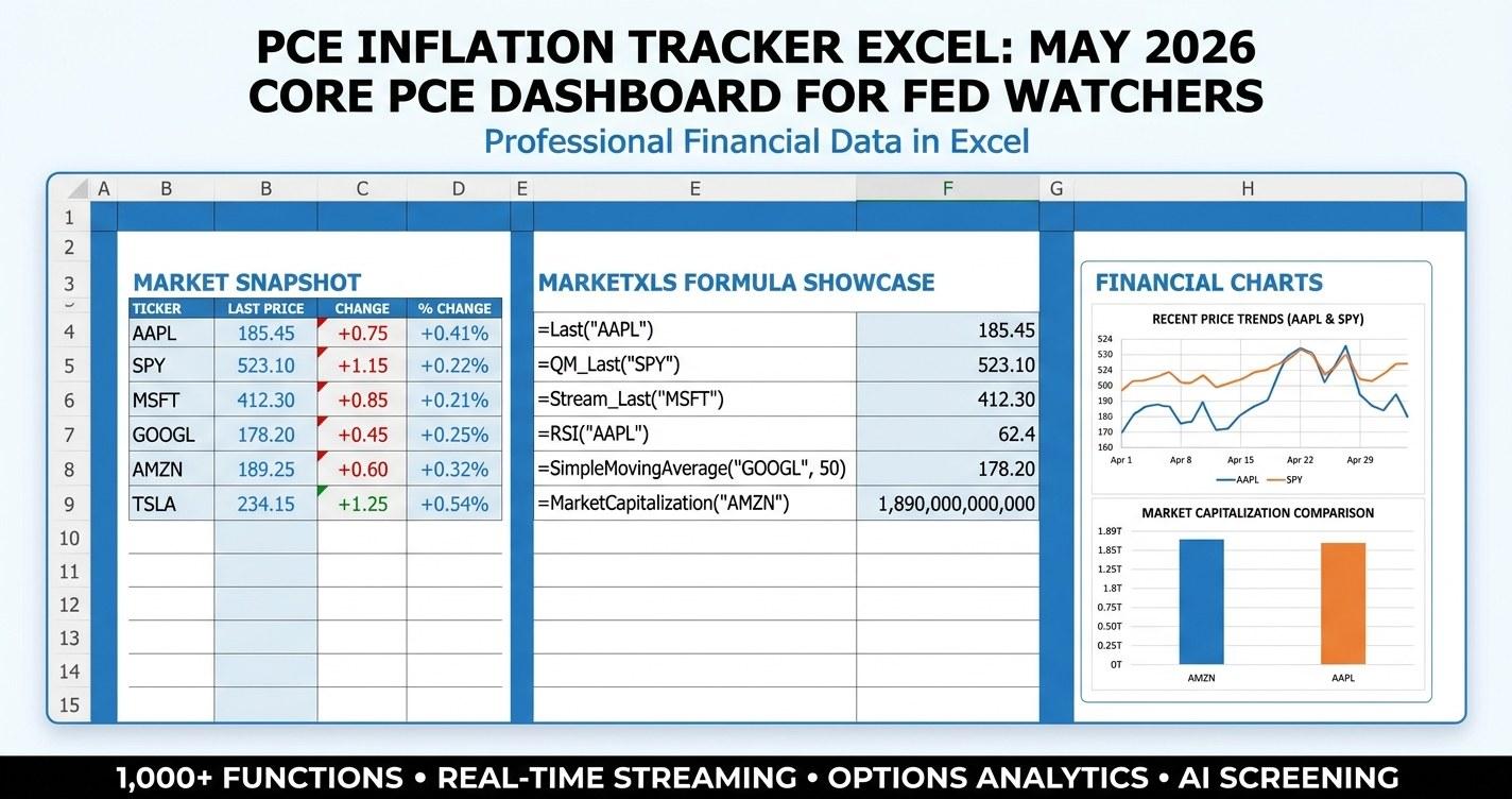
PCE inflation tracker Excel is the workbook every Fed watcher should have open the week the Bureau of Economic Analysis releases the Personal Consumption Expenditures price index. With the next print scheduled for May 30, 2026, covering April 2026 PCE data, the debate over a September rate cut is going to be settled (or extended) by the super-core services number more than by any other line in the report. This guide walks through a six-sheet MarketXLS-powered tracker that pulls live PCE components, CPI cross-checks, Treasury yields, TIPS breakevens, and sector reactions into one dashboard. It is built for the financial advisor, RIA, or self-directed investor who wants a single Excel tab instead of five tabs of FRED charts and a stack of sell-side notes.
What the PCE inflation tracker Excel delivers at a glance
A useful PCE tracker should answer five questions in under a minute:
| Question | Where the tracker answers it |
|---|---|
| What is the current PCE setup vs the Fed 2% target? | Main Dashboard - 18 live macro series from FRED via MarketXLS |
| How do markets react in each PCE outcome scenario? | PCE Scenarios - six surprise paths with historical 30-day analog moves |
| Which sectors hedge a hot PCE print? | Inflation Heatmap - 11 ETFs color-coded by PCE reaction tier |
| Which individual names have pricing power? | Inflation-Hedge Watchlist - 18 tickers grouped by inflation thesis |
| What are TIPS breakevens saying right now? | CPI vs PCE & Macro - side-by-side gauges plus commodity ETFs |
Each cell on the live version is a MarketXLS formula. When the BEA releases the April 2026 PCE numbers on May 30, the workbook updates the moment you press F9. There are no static screenshots, no copy-paste from FRED, and no manual yield curve typing. That is the point.
Download the templates:
- - Pre-filled with current data and formulas visible as comments so you can see exactly which MarketXLS function powers each cell.
- - Live-updating formulas, ready to be opened with the MarketXLS add-in.
Why PCE matters more than CPI to the Federal Reserve
Most retail investors check CPI on the second Tuesday of the month and call it a day. The Federal Reserve does not. The Fed's 2% inflation target is expressed in PCE terms, and the Summary of Economic Projections (SEP) forecasts headline and core PCE specifically. There are four structural reasons PCE wins the policy debate:
- Chain-weighted methodology. CPI uses a fixed basket and updates weights every two years. PCE uses a chain-weighted index that reflects consumer substitution in real time. When ground beef gets pricey and households switch to chicken, PCE captures that immediately.
- Broader scope. PCE includes healthcare paid by employers through insurance and Medicare. CPI only captures out-of-pocket healthcare. Given that healthcare spending is roughly 17% of US GDP, this gap is enormous.
- Smoother behavior. PCE typically runs 30 to 50 basis points below CPI in a normal year because of substitution effects and weighting. That is why an inline CPI print can coexist with a cool PCE print.
- Direct policy linkage. Fed officials cite super-core PCE (services excluding housing) by name in speeches. It is the cleanest signal of underlying labor-driven inflation in the data Powell and the committee actually look at.
For an investor building any Fed-aware portfolio in 2026, that means the workbook you need is a PCE inflation tracker Excel template, not a CPI one. The CPI side is for cross-checks, not for primary signal.
The six sheets of the PCE inflation tracker Excel
Sheet 1: How To Use
A tutorial that lists each sheet, the macro context for the May 30 release, the PCE reaction tier system used throughout the workbook, and links to MarketXLS documentation. The tier system maps every sector into one of four buckets: HEDGE_HOT_PCE, BENEFITS_COOL_PCE, DEFENSIVE, or NEUTRAL. That single mapping drives the color coding on the heatmap and the position-sizing logic on the scenarios sheet.
Sheet 2: Main Dashboard
The dashboard is where the FRED data lives. Eighteen series stream in from MarketXLS macro functions, and three yellow input cells let you overlay your own assumption against the Fed target. The series include:
| Gauge | MarketXLS Formula | What It Tells You |
|---|---|---|
| Headline CPI | =ConsumerPriceIndex() | Top-line CPI index |
| Core CPI | =ConsumerPriceIndexWithoutFoodEnergy() | Cleanest CPI trend |
| CPI Energy | =ConsumerPriceIndexEnergy() | Volatility driver |
| CPI Food | =ConsumerPriceIndexFood() | Sticky component |
| Real PCE Total | =RealPersonalConsumptionExpenditure() | Real consumption base |
| Real PCE Monthly | =RealPersonalConsumptionExpMonthly() | Month-over-month pulse |
| Real PCE Durables | =RealPersonalConsumptionExpDurableGoods() | Big-ticket demand |
| Real PCE Services | =RealPersonalConsumptionExpServices() | Super-core proxy |
| Real Personal Income | =RealPersonalIncome() | Spending power |
| Personal Savings Rate | =PersonalSavingsRate() | Buffer for spending |
| GDP Price Deflator | =GDPPriceDeflator() | Broadest inflation gauge |
| Federal Funds Rate | =FederalFundsRate() | Policy rate |
| 10Y Treasury Yield | =TreasuryRate10Y() | Nominal long rate |
| 10Y TIPS Yield | =TreasuryInflationProtectedSecurities10Y() | Real long rate |
| 10Y Breakeven | =TreasuryRate10Y()-TreasuryInflationProtectedSecurities10Y() | Market inflation expectation |
| Unemployment Rate | =UnemploymentRate() | Fed dual-mandate side |
| 5Y TIPS Yield | =TreasuryInflationProtectedSecurities5Y() | Near-term real rate |
The three input cells let you type a forecast headline PCE YoY, a forecast core PCE YoY, and an expected number of 2026 Fed cuts. The workbook then runs a simple stance classifier: anything over 2.7% core gets tagged HOT, between 2.3% and 2.7% is STICKY, between 2.0% and 2.3% is NEAR TARGET, and under 2.0% is COOL. That classification flows to the scenarios sheet.
Sheet 3: PCE Scenarios
This is the headline analytical sheet. Six PCE outcome paths with historical 30-day analog moves in SPY, TLT, gold, the dollar, and the VIX:
| Scenario | Headline YoY | Core YoY | Svc xHsg MoM | Market Reaction | Fed Implication |
|---|---|---|---|---|---|
| Cool Surprise | 2.1% | 2.4% | 0.15% | Risk-on, bonds rally | Sept cut back on table |
| In Line | 2.3% | 2.6% | 0.22% | Muted | Holds Fed wait-and-see |
| Slight Hot | 2.4% | 2.7% | 0.25% | Bonds sell off | Pushes first cut to Q4 |
| Hot Surprise | 2.6% | 2.9% | 0.32% | Risk-off, bonds dump | No cuts in 2026 narrative |
| Super-Core Sticky | 2.4% | 2.7% | 0.40% | Mixed, sector rotation | Fed higher-for-longer |
| Disinflation | 2.0% | 2.3% | 0.10% | Strong risk-on | Pull-forward of cuts |
The super-core column is the one to watch. Powell has explicitly named services PCE excluding housing as his preferred gauge of underlying labor-driven inflation. A 0.40% month-over-month super-core print, even if the headline matches consensus, will be read as hawkish. A 0.15% super-core print, even if the headline runs a touch hot from energy, will be read as dovish.
The scenarios sheet also lists positioning tilts by scenario. These are educational hypotheses, not recommendations. The framework:
- Cool / Disinflation -> long duration (TLT), long real assets (XLRE, XLU), cyclical discretionary (XLY)
- In Line -> stay diversified, lean broad index exposure
- Slight Hot -> trim duration, lean value and short-duration credit
- Hot Surprise -> energy, materials, staples, plus a cash buffer
- Super-Core Sticky -> defensive growth, healthcare, gold (the stagflation barbell)
Sheet 4: Inflation Heatmap
Eleven sector SPDR ETFs color-coded by PCE reaction tier. The tier mapping reflects how each sector typically responds to a hot or cool surprise:
| Ticker | Sector | PCE Tier | Why |
|---|---|---|---|
| XLE | Energy | HEDGE_HOT_PCE | Pricing-power, commodity passthrough |
| XLB | Materials | HEDGE_HOT_PCE | Commodity-linked revenue |
| XLP | Consumer Staples | HEDGE_HOT_PCE | Brand pricing power |
| XLRE | Real Estate | BENEFITS_COOL_PCE | Long-duration cash flows |
| XLU | Utilities | BENEFITS_COOL_PCE | Bond-proxy income |
| XLY | Consumer Discretionary | BENEFITS_COOL_PCE | Rate-sensitive demand |
| XLK | Technology | BENEFITS_COOL_PCE | Long-duration growth |
| XLF | Financials | NEUTRAL | Curve-dependent |
| XLI | Industrials | NEUTRAL | Capex cycle dependent |
| XLV | Health Care | DEFENSIVE | Tail-risk hedge |
| XLC | Communication | NEUTRAL | Mixed exposure |
Each row pulls a live price, five-day move, one-month move, year-to-date move, RSI, and distance from the 52-week high. The signal column flags OVERBOUGHT (RSI > 70), OVERSOLD (RSI < 30), STRONG, WEAK, or NEUTRAL based on the YTD move. Combine the tier with the signal: a HEDGE_HOT_PCE sector that is also OVERSOLD becomes interesting going into a release with hot whisper numbers.
Sheet 5: Inflation-Hedge Watchlist
Eighteen individual names selected for either commodity exposure, brand pricing power, or real-asset rent escalators. The list spans seven groups:
- Energy: XOM, CVX, COP - direct passthrough of energy CPI/PCE
- Materials: FCX (copper), NEM (gold), NUE (steel) - commodity producers
- Staples: PG, KO, WMT, PEP - brand and scale pricing power
- Real Assets: PLD, O - REITs with inflation-linked rent escalators
- Utilities: DUK, SO - rate-base passthrough
- Payments: V, MA - transaction-fee inflation lift
- Industrials & Discretionary: CAT, HD - capex cycle and real-wage indicators
Each row pulls Price, P/E, Dividend Yield, Beta, RSI, Distance from 52-Week High, Market Cap, and a custom Inflation-Hedge Score. The score formula rewards dividend yield, reasonable P/E, a not-overbought RSI, proximity to the 52-week high, and lower beta:
=IF(ISNUMBER(G5),IF(G5>3,20,IF(G5>2,10,0)),0)
 +IF(ISNUMBER(F5),IF(F5<15,20,IF(F5<22,10,0)),0)
 +IF(ISNUMBER(I5),IF(I5<60,15,IF(I5<70,5,0)),0)
 +IF(ISNUMBER(J5),IF(J5>-10,15,IF(J5>-20,5,0)),0)
 +IF(ISNUMBER(H5),IF(H5<1.0,15,IF(H5<1.2,5,0)),0)
The maximum score is 85. Anything above 60 is a candidate for further work. Anything below 30 is a flag to either pass or wait for a better setup.
Sheet 6: CPI vs PCE & Macro
The reconciliation sheet. The top half lays CPI components side by side with PCE components and notes which CPI gauge maps to which PCE gauge (or vice versa, where one of them is simply absent). The bottom half lists ten inflation-linked and commodity ETFs:
| Ticker | Why It Matters For PCE |
|---|---|
| TIP | TIPS breakeven proxy |
| STIP | Short-end inflation expectations |
| LTPZ | Long-duration real yield |
| TLT | Nominal long bond reacts to cool PCE |
| IEF | 10Y proxy |
| UUP | Dollar Index proxy (hot PCE = USD up) |
| GLD | Real-yield-sensitive inflation hedge |
| USO | Oil pass-through to headline PCE |
| DBC | Broad commodity basket |
| VNQ | Real-asset hedge with rate sensitivity |
The reading guide at the bottom of the sheet lists five quick rules of thumb. The most useful one for PCE day: GLD up plus UUP down equals real yields falling AND inflation expectations rising, which is the classic cool PCE pattern.
How to use the PCE inflation tracker Excel on release day
The morning of a PCE release, the BEA publishes at 8:30 AM Eastern. The data hits FRED within ten minutes. MarketXLS pulls from FRED, so by 8:45 AM your dashboard reflects the new headline, core, services, durables, and nondurables prints. The recommended workflow:
- 8:25 AM - Open the workbook. Read the input row on the Main Dashboard. Your forecast vs the Fed 2% target is already plotted.
- 8:30 AM - The print drops. Press F9 to recalculate.
- 8:31 AM - Read the headline YoY, core YoY, and services month-over-month. Compare against your inputs.
- 8:35 AM - Jump to PCE Scenarios. Identify which row your print matches.
- 8:40 AM - Open the Inflation Heatmap. Note which tier is most aligned with the print.
- 8:50 AM - Cross-check the Watchlist for individual names with high Inflation-Hedge Scores in the matching tier.
- 9:30 AM - Open the CPI vs PCE & Macro sheet. Watch TIPS breakeven (
=TreasuryRate10Y()-TreasuryInflationProtectedSecurities10Y()) for confirmation.
By 9:45 AM, you have a clear read of the print, the analog playbook, and the names that map to your scenario. That is roughly 75 minutes before the equity market open at 9:30 AM and a clean read of the tape for the day.
How MarketXLS sources the PCE data
MarketXLS connects directly to FRED through a set of macro functions. The data is the same official series the Fed staff use. Each function takes no arguments and returns the latest value:
=RealPersonalConsumptionExpenditure()      -> Real PCE total ($B)
=RealPersonalConsumptionExpMonthly()       -> Monthly real PCE ($B)
=RealPersonalConsumptionExpDurableGoods()  -> Real PCE durables ($B)
=RealPersonalConsumptionExpNonDurableGoods() -> Real PCE nondurables ($B)
=RealPersonalConsumptionExpServices()      -> Real PCE services ($B)
=RealPersonalIncome()                      -> Real personal income ($B)
=PersonalSavingsRate()                     -> Savings rate (%)
=GDPPriceDeflator()                        -> GDP deflator (index)
=ConsumerPriceIndex()                      -> CPI headline (index)
=ConsumerPriceIndexWithoutFoodEnergy()     -> Core CPI (index)
=ConsumerPriceIndexEnergy()                -> CPI energy (index)
=ConsumerPriceIndexFood()                  -> CPI food (index)
=FederalFundsRate()                        -> Effective Fed Funds rate (%)
=TreasuryRate10Y()                         -> 10Y Treasury yield (%)
=TreasuryInflationProtectedSecurities10Y() -> 10Y TIPS yield (%)
=TreasuryInflationProtectedSecurities5Y()  -> 5Y TIPS yield (%)
=UnemploymentRate()                        -> Unemployment rate (%)
For ticker-level data on the Heatmap and Watchlist, MarketXLS uses its QuoteMedia data feed:
=QM_Last("XLE")                  -> Current sector ETF price
=RSI("XLE")                      -> 14-day RSI
=FiftyTwoWeekHigh("XLE")         -> 52-week high
=PERatio("PG")                   -> Trailing P/E
=DividendYield("O")              -> Dividend yield (decimal)
=Beta("FCX")                     -> Beta vs market
=MarketCapitalization("V")       -> Market cap ($)
That is what makes the workbook reproducible. The same eighteen formulas drive every refresh. No one is downloading a CSV from FRED, no one is renaming columns, and no one is wondering whether the YoY they calculated lines up with the BEA's official figure.
Reading super-core PCE for the September cut
Super-core PCE is calculated as services PCE excluding housing. It is the gauge Fed officials have repeatedly named in 2024 and 2025 speeches when explaining why they wanted to see more progress before cutting. Three thresholds matter for the September 2026 cut narrative going into the May 30 release:
- Month-over-month under 0.20% - clean disinflation print. September cut probability rises.
- 0.20% to 0.30% - sticky but not alarming. Fed stays on hold but tone shifts dovish.
- Above 0.30% - hot. September cut probability drops, market repositions.
The smoother gauges most Fed officials watch are the three-month and six-month annualized super-core rates. A single hot month is forgivable. A three-month run rate above 3% annualized is not. Build a small auxiliary table in the workbook that tracks the rolling three-month and six-month annualized super-core: that is where the next Fed pivot narrative actually gets shaped.
Building the PCE inflation tracker in Excel yourself
If you want to recreate the workbook from scratch, the recipe is:
- Six sheets following the structure above.
- Yellow input cells on the Main Dashboard for your headline PCE forecast, core PCE forecast, and Fed cut expectation.
- Macro series pulled with the MarketXLS functions listed above.
- Sector and watchlist rows with
=QM_Last,=RSI,=FiftyTwoWeekHigh,=PERatio,=DividendYield,=Beta, and=MarketCapitalization. - A custom Inflation-Hedge Score that rewards dividend yield, low P/E, reasonable RSI, proximity to 52-week high, and lower beta.
- Conditional formatting on the Heatmap to color-code tiers and signal cells.
- A scenario table with six rows and historical analog 30-day moves.
- A CPI vs PCE comparison so you remember which gauge to weight when.
The Function Docs MCP at marketxls.com/excel-app/add-in/help lists every macro and equity function with its full syntax. Verify before typing. The hardest mistake to debug is a misspelled function name that returns #NAME? when the workbook recalculates on release morning.
Frequently asked questions about PCE inflation tracker Excel
What is PCE inflation and why is it different from CPI?
PCE inflation is the Personal Consumption Expenditures price index, published monthly by the Bureau of Economic Analysis. It differs from the Consumer Price Index in three structural ways: it uses chain-weighted methodology that captures consumer substitution, it has broader scope including employer-paid healthcare and Medicare, and it typically runs about 30 to 50 basis points below CPI. The Federal Reserve's 2% inflation target is defined in PCE terms, which is why PCE moves markets more than CPI when the two diverge.
When is the next PCE release?
The April 2026 PCE report is scheduled for release on May 30, 2026, at 8:30 AM Eastern. The May 2026 PCE data will be released on June 27, 2026. The BEA generally releases the PCE price index on the last business day of the month, covering data from the prior month.
What is super-core PCE and why does the Fed focus on it?
Super-core PCE is services PCE excluding housing. Federal Reserve officials including Chair Jerome Powell have cited super-core repeatedly as the cleanest gauge of underlying labor-driven inflation, because it strips out the volatile food and energy components as well as the lagging owners equivalent rent component. A super-core month-over-month above 0.30% is read as hot. Below 0.20% is read as disinflation. The Fed tracks the three-month and six-month annualized super-core to smooth out monthly noise.
Which MarketXLS functions track PCE inflation?
MarketXLS has direct functions for the PCE components: =RealPersonalConsumptionExpenditure() for total real PCE, =RealPersonalConsumptionExpMonthly() for monthly real PCE, =RealPersonalConsumptionExpDurableGoods() for durables, =RealPersonalConsumptionExpNonDurableGoods() for nondurables, and =RealPersonalConsumptionExpServices() for services (the super-core proxy). Related Fed data includes =FederalFundsRate(), =TreasuryRate10Y(), =TreasuryInflationProtectedSecurities10Y() for the TIPS real yield, and =UnemploymentRate() for the dual-mandate side.
Which sectors hedge a hot PCE print?
Historically, three sector groups tend to outperform on a hot PCE surprise: Energy (XLE) and Materials (XLB) for commodity passthrough, Consumer Staples (XLP) for brand pricing power, and select Industrials (XLI) names that can pass through input costs. The Inflation-Hedge Watchlist on Sheet 5 of the tracker drills down into eighteen specific names across these tiers. None of this is investment advice. Past sector reactions to PCE releases are not guaranteed to repeat.
How does a cool PCE print affect Treasury bonds?
A cool PCE print typically rallies the long end of the Treasury curve more than the short end. The intuition: a cool print raises the odds of Fed cuts later in the year, which lowers real yields, which lifts long-duration nominal bonds. TLT (20+ Year Treasury ETF) tends to move 2-4x more per basis point than IEF (7-10 Year Treasury ETF) because of duration. Watch the 10-year breakeven, calculated as =TreasuryRate10Y()-TreasuryInflationProtectedSecurities10Y(), for the cleanest signal of the market's revised inflation expectations.
Can the tracker be adapted for European inflation data?
The tracker is structured around US PCE because the Federal Reserve targets PCE. However, the same sheet structure (Dashboard, Scenarios, Heatmap, Watchlist, Macro Reconciliation) can be adapted for the eurozone HICP and ECB rate cycle, the UK CPI and Bank of England cycle, or the Japanese CPI and Bank of Japan cycle. Swap the macro functions and the sector ETF list and the framework holds.
The bottom line for PCE inflation tracker Excel
A PCE inflation tracker Excel built with MarketXLS gives you four things at once: the latest BEA print with a single press of F9, a scenario framework that maps each outcome to historical analog moves, a sector heatmap that tells you which side of the inflation trade is currently extended, and an inflation-hedge watchlist with a scoring system that scans eighteen names in seconds. The May 30, 2026 release is the most important PCE print of the second quarter, and the workbook is built to keep the read disciplined while the headlines fly.
To explore the full MarketXLS function library or get a guided tour of the macro and Treasury data feed, visit marketxls.com or book a demo. For more market-event-driven Excel workbooks, see the FOMC Meeting Tracker and Treasury Bill Ladder Calculator.
This blog post is for educational purposes only. It is not investment advice, a recommendation, or a forecast. Verify all data and consult a licensed financial advisor before making any investment decision.