
Understanding portfolio optimization theory is one thing. Actually implementing it in a way that helps you make better investment decisions is another. That's where Excel comes in.
Excel has become the standard tool for portfolio analysis and optimization for good reason. It's flexible, transparent, and lets you see exactly how your portfolios are constructed and performing. You're not relying on black-box algorithms or proprietary systems. Every calculation, every assumption, every result is right there in front of you.
In this guide, we'll walk through how to build comprehensive portfolio optimization models in Excel. We'll cover everything from basic setup to advanced analytics, showing you the specific functions and formulas you need to analyze risk, calculate performance metrics, and visualize optimal portfolio allocations.
If you haven't already, we recommend reading our complete guide to portfolio optimization and Modern Portfolio Theory first. It covers the theoretical foundation that underlies all the metrics and calculations we'll discuss here.
Why Excel for Portfolio Optimization?
Before we dive into the specifics, let's talk about why Excel remains the tool of choice for serious portfolio analysis.
Complete transparency: Every cell, every formula, every calculation is visible and auditable. You can trace exactly how each metric is calculated and verify the logic behind your analysis.
Flexibility: Excel lets you customize your analysis to your specific needs. Want to add a custom risk metric? Need to account for unique tax considerations? You can build exactly what you need.
Integration with existing workflows: Most investment professionals already use Excel for other tasks. Portfolio optimization becomes part of your existing toolkit rather than requiring a separate system.
Real-time updates: Connect your spreadsheet to live market data and your portfolio metrics update automatically. No manual data entry, no delays.
Easy to share and explain: Excel files are universal. You can share your analysis with colleagues, clients, or compliance teams. Anyone can open the file and understand your methodology.
The key is having the right functions and formulas to implement sophisticated portfolio optimization techniques without building everything from scratch. That's where purpose-built portfolio functions come in.
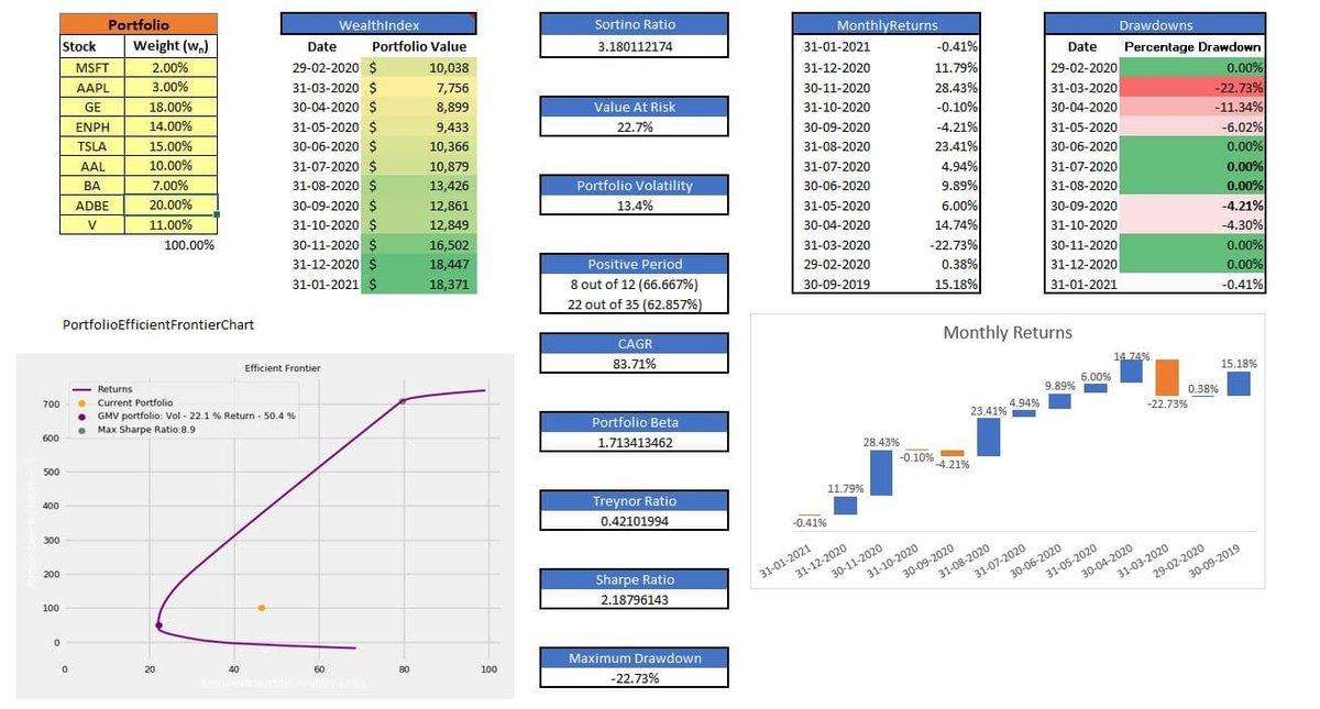
Portfolio Analysis Dashboard
Setting Up Your Portfolio in Excel
Portfolio optimization in Excel starts with a simple structure: a list of your holdings and their weights.
Here's the basic setup:
In one column, list your stock symbols (AAPL, MSFT, TSLA, etc.). In the adjacent column, list what percentage of your portfolio each stock represents. The weights should total 100%.
For example:
- AAPL: 25%
- MSFT: 20%
- GOOGL: 15%
- TSLA: 10%
- JPM: 15%
- JNJ: 15%
That's it. You define your portfolio as a range in Excel (let's say A2:B8), and you're ready to start analyzing.
The beauty of this approach is that you don't need to download historical price data manually. The portfolio functions handle data retrieval automatically, pulling accurate historical prices and calculating all the metrics you need based on your portfolio definition.
Performance Analysis: Tracking Returns Over Time
The foundation of portfolio optimization is understanding how your portfolio performs. These functions give you detailed insight into returns and growth.
Monthly Returns
The =MonthlyReturns() function calculates the percentage change in your portfolio value from one month to the next. This gives you a clear picture of how your portfolio performs over time and helps you identify patterns in volatility.
=MonthlyReturns(A2:B8, 36)
This calculates monthly returns for your portfolio over the past 36 months (3 years). You can adjust the periods parameter to analyze different timeframes. Looking at monthly returns helps you understand the rhythm of your portfolio: Are returns consistent? Are there seasonal patterns? How often do you experience negative months?
Monthly returns are particularly useful for identifying volatility clustering. Markets often go through periods of calm followed by periods of turbulence. Seeing this pattern in your monthly returns helps you prepare for and manage through volatile periods.
Wealth Index
The =WealthIndex() function shows how an initial $10,000 investment would have grown over time. This is one of the most intuitive ways to visualize portfolio performance because it translates percentage returns into actual dollar growth.
=WealthIndex(A2:B8, 60)
This shows what would have happened to $10,000 invested in your portfolio over the past 60 months (5 years). The wealth index makes it easy to compare different portfolio allocations or benchmark your performance against market indices.
For example, if your wealth index shows $15,000 after 5 years while the S&P 500 wealth index shows $18,000, you know your portfolio underperformed the market by a significant margin. That insight might prompt you to reconsider your allocation strategy.
Positive Periods
The =PositivePeriods() function counts how many periods had returns higher than the preceding period. This gives you a sense of momentum and consistency.
=PositivePeriods(A2:B8)
A portfolio with more positive periods tends to have smoother upward trajectory, which many investors find psychologically easier to stick with. Frequent negative periods, even if the overall return is good, can test your discipline during market stress.
Risk Measurement: Understanding Portfolio Volatility
Returns tell only half the story. Understanding risk is equally important for portfolio optimization. These functions help you quantify different dimensions of portfolio risk.
Portfolio Beta
=PortfolioBeta() measures how your portfolio moves relative to the overall market. By default, it uses the S&P 500 (SPY) as the market benchmark.
=PortfolioBeta(A2:B8)
A beta of 1.0 means your portfolio moves in line with the market. A beta of 1.2 means your portfolio tends to move 20% more than the market (higher volatility). A beta of 0.8 means your portfolio moves 20% less than the market (lower volatility).
Understanding your portfolio's beta helps you set realistic expectations. If you have a high-beta portfolio, you should expect larger swings both up and down. If you have a low-beta portfolio, you'll generally experience smoother (but potentially lower) returns.
Portfolio Beta Analysis
Portfolio Volatility
=PortfolioVolatility() calculates the standard deviation of your portfolio's returns. This is the classic measure of total risk in Modern Portfolio Theory.
=PortfolioVolatility(A2:B8)
Higher volatility means more uncertainty about future returns. A portfolio with 15% volatility will experience wider swings than a portfolio with 8% volatility. But remember, volatility itself isn't necessarily bad. Some volatility reflects upside potential, not just downside risk.
The key is matching volatility to your risk tolerance and investment timeframe. A young investor with decades until retirement can generally tolerate higher volatility than someone approaching retirement.
Drawdown
=Drawdown() shows the percentage decline in your portfolio during the entire month. This helps you understand how often your portfolio experiences losses and how severe those losses tend to be.
=Drawdown(A2:B8)
Looking at drawdown data helps you prepare psychologically for difficult periods. If your portfolio typically experiences 5-10% monthly drawdowns a few times per year, you know that's normal behavior. You're less likely to panic and make poor decisions when those drawdowns occur.
Maximum Drawdown
=MaximumDrawdowns() identifies the largest peak-to-trough decline your portfolio has experienced before recovering to a new high. This is one of the most important risk metrics for understanding worst-case scenarios.
=MaximumDrawdowns(A2:B8)
Maximum drawdown answers the critical question: "What's the worst loss I would have experienced?" If your portfolio's maximum drawdown is 35%, you need to be comfortable potentially losing more than a third of your portfolio value during severe market stress.
Many investors significantly underestimate their true risk tolerance until they experience a major drawdown. Looking at historical maximum drawdowns helps you stress-test whether your current allocation truly matches your ability to handle losses.
Value at Risk
=ValueAtRisk() estimates the maximum potential loss over a specific time period at a given confidence level. This gives you a probabilistic view of downside risk.
=ValueAtRisk(A2:B8)
Value at Risk is particularly useful for setting stop-loss rules or determining appropriate position sizes. If your VaR suggests you could lose $50,000 with 5% probability over the next month, you can decide whether that level of risk is acceptable given your goals and constraints.
Risk-Adjusted Performance: The Most Important Metrics
Raw returns don't tell you whether you're being adequately compensated for the risk you're taking. Risk-adjusted metrics combine return and risk into single measures that let you compare different portfolios on an apples-to-apples basis.
Sharpe Ratio
The =SharpeRatio() function calculates your portfolio's excess return per unit of risk. It's the gold standard for evaluating risk-adjusted performance.
=SharpeRatio(A2:B8)
The Sharpe ratio answers the question: "How much extra return am I getting for each unit of volatility I'm accepting?" Higher Sharpe ratios indicate better risk-adjusted performance.
A Sharpe ratio of 1.0 or higher is generally considered good. Ratios above 2.0 are exceptional and rare over long periods. If you're comparing two portfolios, the one with the higher Sharpe ratio is delivering better returns relative to its risk, even if its absolute returns are lower.
When you're optimizing portfolios based on Modern Portfolio Theory principles, maximizing the Sharpe ratio is often the objective. Portfolios on the efficient frontier have the highest possible Sharpe ratio for their level of risk.
Sortino Ratio
The =SortinoRatio() function is similar to the Sharpe ratio but focuses only on downside volatility. It recognizes that upside volatility (big gains) isn't actually a problem for investors.
=SortinoRatio(A2:B8)
The Sortino ratio is often more relevant than the Sharpe ratio for investors who care primarily about avoiding losses rather than smoothing all volatility. A portfolio might have high total volatility due to occasional large gains, which would lower its Sharpe ratio but shouldn't necessarily be penalized.
If you're evaluating aggressive growth portfolios that might have significant upside volatility, the Sortino ratio gives you a clearer picture of downside-adjusted performance.
Treynor Ratio
The =TreynorRatio() function measures returns relative to systematic market risk (beta) rather than total volatility.
=TreynorRatio(A2:B8)
The Treynor ratio is most useful for well-diversified portfolios where unsystematic (company-specific) risk has been eliminated. It tells you how much return you're earning per unit of market risk you can't diversify away.
For portfolios that are already highly diversified, the Treynor ratio can be more informative than the Sharpe ratio because it focuses on the risk that actually matters (market risk) rather than total volatility.
Portfolio Optimization: Visualizing the Efficient Frontier
The efficient frontier is the set of optimal portfolios that offer the highest expected return for each level of risk. Visualizing the efficient frontier helps you understand whether your current allocation is truly optimized or if better alternatives exist.
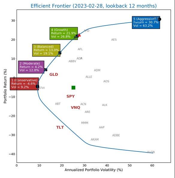
Efficient Frontier Chart
Efficient Frontier Chart
The =PortfolioEfficientFrontierChart() function generates a ready-made chart showing the efficient frontier for your portfolio.
=PortfolioEfficientFrontierChart(A2:B8, 36)
This creates a visual representation of the risk-return tradeoff. The chart plots numerous potential portfolio allocations, showing their expected return (vertical axis) versus their risk/volatility (horizontal axis).
Portfolios on the curved line at the top-left are "efficient." They offer the maximum return possible for each level of risk. Portfolios below this curve are suboptimal because you could get better returns with the same risk, or lower risk with the same returns.
You can plot your current portfolio on this chart to see how it compares to the efficient frontier. If your portfolio is significantly below the efficient frontier, you have opportunities to improve your allocation.
Efficient Frontier Data
The =PortfolioEfficientFrontierData() function provides the raw data behind the efficient frontier chart. This gives you the actual portfolio weights and metrics for optimal allocations at different risk levels.
=PortfolioEfficientFrontierData(A2:B8, 36)
This data shows you exactly how to construct portfolios along the efficient frontier. For example, it might tell you that a portfolio with 45% stocks, 35% bonds, and 20% alternatives offers 8% expected return with 12% volatility, while a portfolio with 70% stocks, 20% bonds, and 10% alternatives offers 10% expected return with 16% volatility.
Having this data lets you select the specific risk-return profile that matches your goals and then see exactly how to allocate your assets to achieve it.
Building Your Portfolio Analytics Dashboard
Now that you understand the individual functions, let's talk about putting them together into a comprehensive portfolio analytics dashboard.
A well-designed dashboard gives you a complete picture of your portfolio's performance, risk, and optimization at a glance. Here's what to include:
Performance section: Monthly returns chart, wealth index growth curve, and cumulative return statistics. This shows how your portfolio has grown and how consistent that growth has been.
Risk section: Portfolio volatility, beta, maximum drawdown, and Value at Risk. This quantifies your portfolio's risk profile from multiple angles.
Risk-adjusted metrics: Sharpe ratio, Sortino ratio, and Treynor ratio. These tell you whether you're being adequately compensated for the risk you're taking.
Optimization analysis: Efficient frontier chart with your current portfolio plotted. This shows whether your allocation is truly optimized or if improvements are possible.
Holdings breakdown: Table showing each position, its weight, contribution to return, and contribution to risk. This helps you identify which holdings are driving performance and which might need adjustment.
You can explore a complete portfolio analytics template that demonstrates these concepts in action. The template includes all the key metrics and visualizations discussed here, providing a ready-made framework you can adapt to your needs.
For more focused portfolio management workflows, the portfolio management template offers a streamlined approach to tracking holdings and monitoring performance.
Portfolio Rebalancing Strategies
Portfolio optimization isn't a one-time exercise. Even if you start with an optimal allocation, market movements will cause your portfolio to drift away from your targets over time. Stocks that perform well will become a larger percentage of your portfolio, while underperforming assets will shrink.
Rebalancing is the process of returning your portfolio to its target allocation. Here are the main approaches:
Calendar rebalancing: Rebalance on a fixed schedule (quarterly, semi-annually, or annually). This approach is simple and systematic but might miss opportunities or rebalance unnecessarily.
Threshold rebalancing: Rebalance only when any asset deviates from its target weight by a specified percentage (often 5-10%). This approach is more responsive to market movements and can reduce unnecessary trading.
Hybrid approach: Combine both methods by checking quarterly whether any positions have drifted beyond your threshold. This balances systematic monitoring with responsive action.
When rebalancing, use your Excel model to evaluate how proposed changes affect your portfolio metrics. Will rebalancing improve your Sharpe ratio? How will it impact your portfolio's beta and volatility? The functions we've discussed let you model these changes before executing them.
Excel makes it easy to create rebalancing scenarios. Copy your current portfolio allocation, adjust the weights to your targets, and compare the risk-return metrics between the current and target portfolios. This helps ensure that rebalancing actually improves your position rather than just creating unnecessary trading costs.
Practical Tips for Excel-Based Portfolio Optimization
Here are some best practices for getting the most from your Excel portfolio models:
Use named ranges: Instead of referencing A2:B8 repeatedly, name your portfolio range something like "MyPortfolio." This makes formulas easier to read and maintain.
Build scenarios: Create multiple versions of your portfolio with different allocations. Compare their metrics side by side to understand the impact of allocation decisions.
Track changes over time: Save monthly snapshots of your portfolio metrics. This creates a history that helps you understand how your portfolio characteristics evolve.
Document assumptions: Add comments explaining how you've set up calculations, what time periods you're analyzing, and what benchmarks you're using. Future you will thank present you.
Validate results: Spot-check your calculations against published data or alternative sources. Excel is powerful but errors in formulas or data can lead to misleading results.
Consider tax implications: While the functions calculate pre-tax returns, remember that rebalancing and portfolio changes can trigger taxable events. Factor this into your optimization decisions.
You can learn more about comprehensive portfolio management tools and functions at the MarketXLS Portfolio Manager page, which provides detailed documentation on all available portfolio analytics capabilities.
From Theory to Practice
Portfolio optimization in Excel transforms abstract concepts from Modern Portfolio Theory into actionable insights. You're not just reading about efficient frontiers and Sharpe ratios. You're calculating them for your actual portfolios and using them to make better allocation decisions.
The functions we've covered give you professional-grade analytics without requiring programming skills or expensive specialized software. You can calculate everything from basic returns to sophisticated risk-adjusted metrics, all within the familiar Excel environment.
But portfolio optimization doesn't stop with the tools covered here. For investors managing larger, more complex portfolios, there are advanced optimization techniques that go beyond traditional MPT. The Black-Litterman model provides a sophisticated framework for incorporating your market views into portfolio optimization, while other advanced approaches address some of MPT's limitations in different ways.
Whether you're managing your own portfolio or analyzing investments professionally, mastering Excel-based portfolio optimization gives you a powerful advantage. You can make data-driven decisions, communicate clearly about risk and return, and continuously improve your allocation strategy based on solid quantitative analysis.
The key is making these tools part of your regular investment process. Portfolio optimization isn't something you do once and forget. It's an ongoing practice of measuring, analyzing, and refining your approach. Excel makes that practice accessible, transparent, and effective.
Previous in Series: Portfolio Optimization & Modern Portfolio Theory: Complete Guide
Next in Series: Advanced Portfolio Optimization: Black-Litterman Model & AI Techniques
Series Overview: Portfolio Optimization Series
